웹사이트 상단바 고정하기
상단바 고정이란?
스크롤을 이용해서 화면을 움직이더라도 상단의 레이아웃이 고정된 형태로 따라다니는 형태를 말해요.
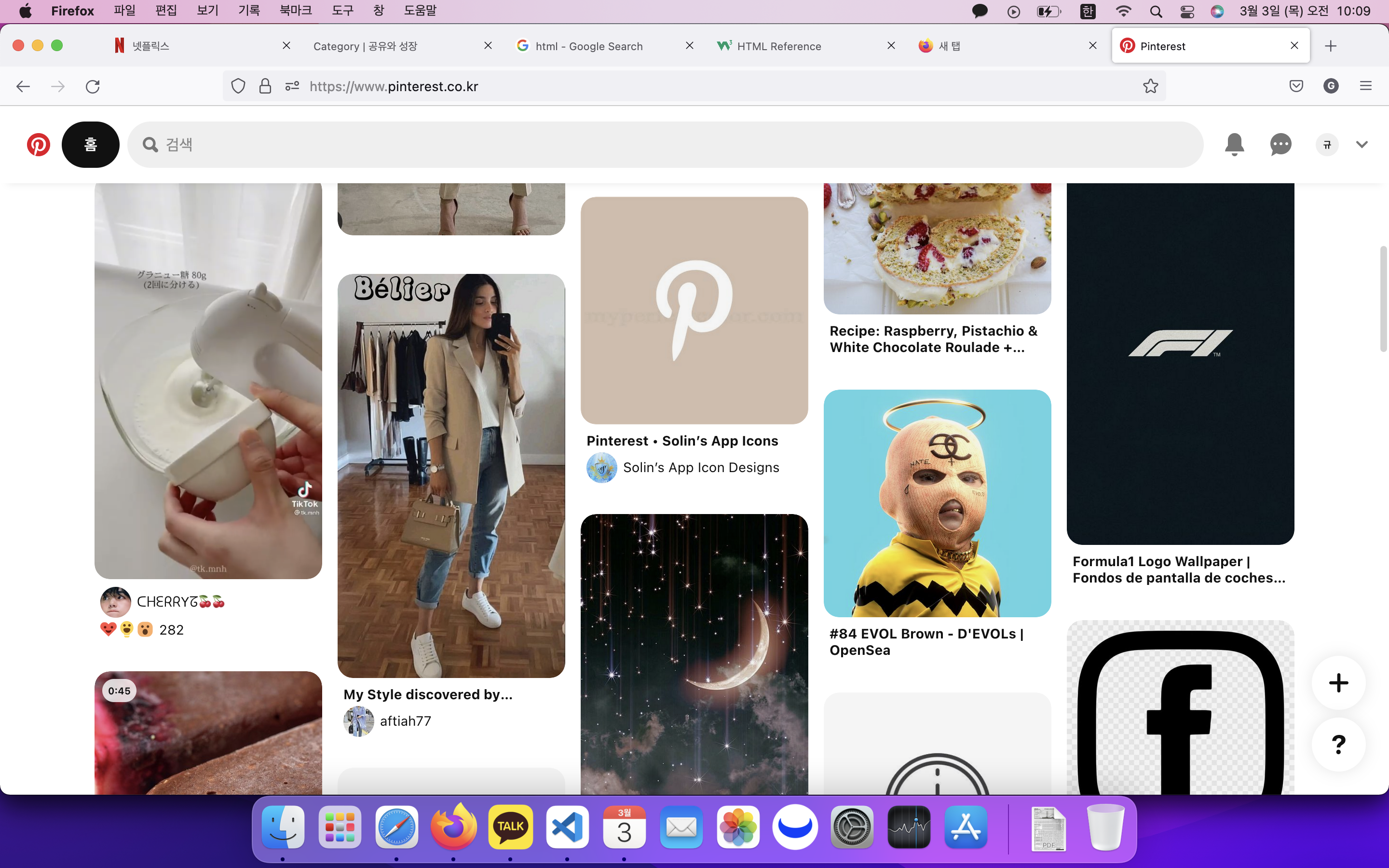
여러 유명한 웹사이트를 들어가보면, 상단바가 고정된 형태의 디자인을 쉽게 볼 수 있어요.
Webull
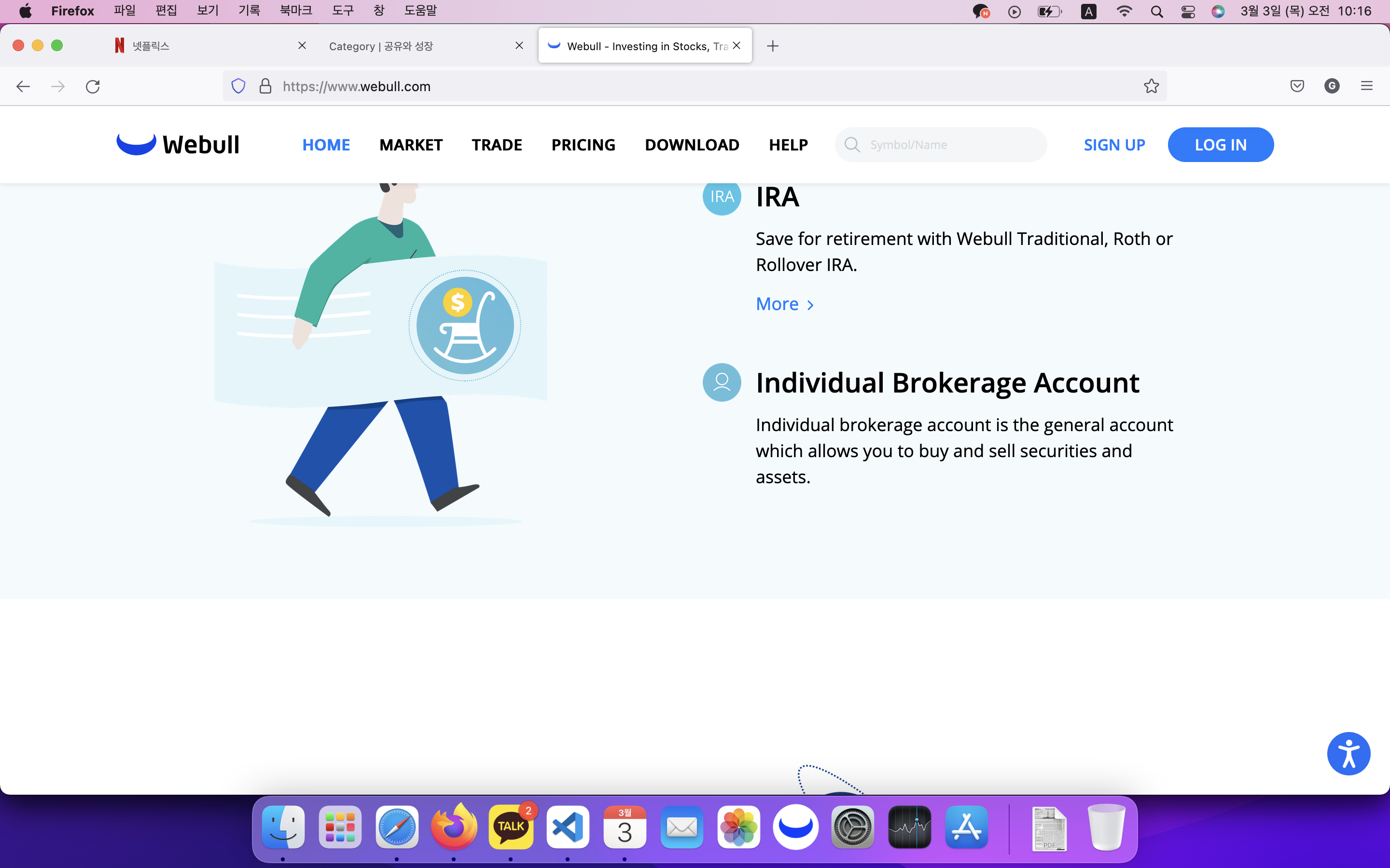
상단바를 고정함으로써 사용자는 쉽게 다른 메뉴에 접근할 수 있습니다.
CSS를 이용해서 상단바를 고정하는 방법
정확히는 상단바를 고정하기보다는 특정 영역을 고정해주는 방식이라고 볼 수 있어요.
기본 HTML 코드
일단 아래와 같이 청록색의 상단바와 베이지색의 메인 컨텐츠 영역을 지정해줄게요.
아직은 상단바를 고정해주지 않았기 때문에, 스크롤을 내려도 상단바가 고정되지는 않아요.
<!DOCTYPE html>
<html lang="en">
<head>
    <meta charset="UTF-8">
    <meta http-equiv="X-UA-Compatible" content="IE=edge">
    <meta name="viewport" content="width=device-width, initial-scale=1.0">
    <title>Top layout fix</title>
    <style>
        * {
            margin: 0px;
            border: 0px;
        }

        .topLayout {
            margin-left: 100px;
            margin-right: 100px;
            height: 100px;
            background-color: aquamarine;
        }

        .mainContents {
            height: 2000px;
            background-color: beige;
        }
    </style>
</head>
<body>
    <div class = "topLayout"></div>
    <div class = "mainContents"></div>
</body>
</html>
CSS추가하여 상단바 고정해주기
여기서 상단바를 고정해주려면, CSS의 position 속성 중 sticky이라는 속성을 사용해주시면 됩니다~!
style 부분의 topLayout에 아래와 같이 코드를 추가해주세요!
<style>
    * {
        margin: 0px;
        border: 0px;
    }

    .topLayout {
        position: sticky;
        top: 0px;

        margin-left: 100px;
        margin-right: 100px;
        height: 100px;
        background-color: aquamarine;
    }

    .mainContents {
        height: 2000px;
        background-color: beige;
    }
</style>
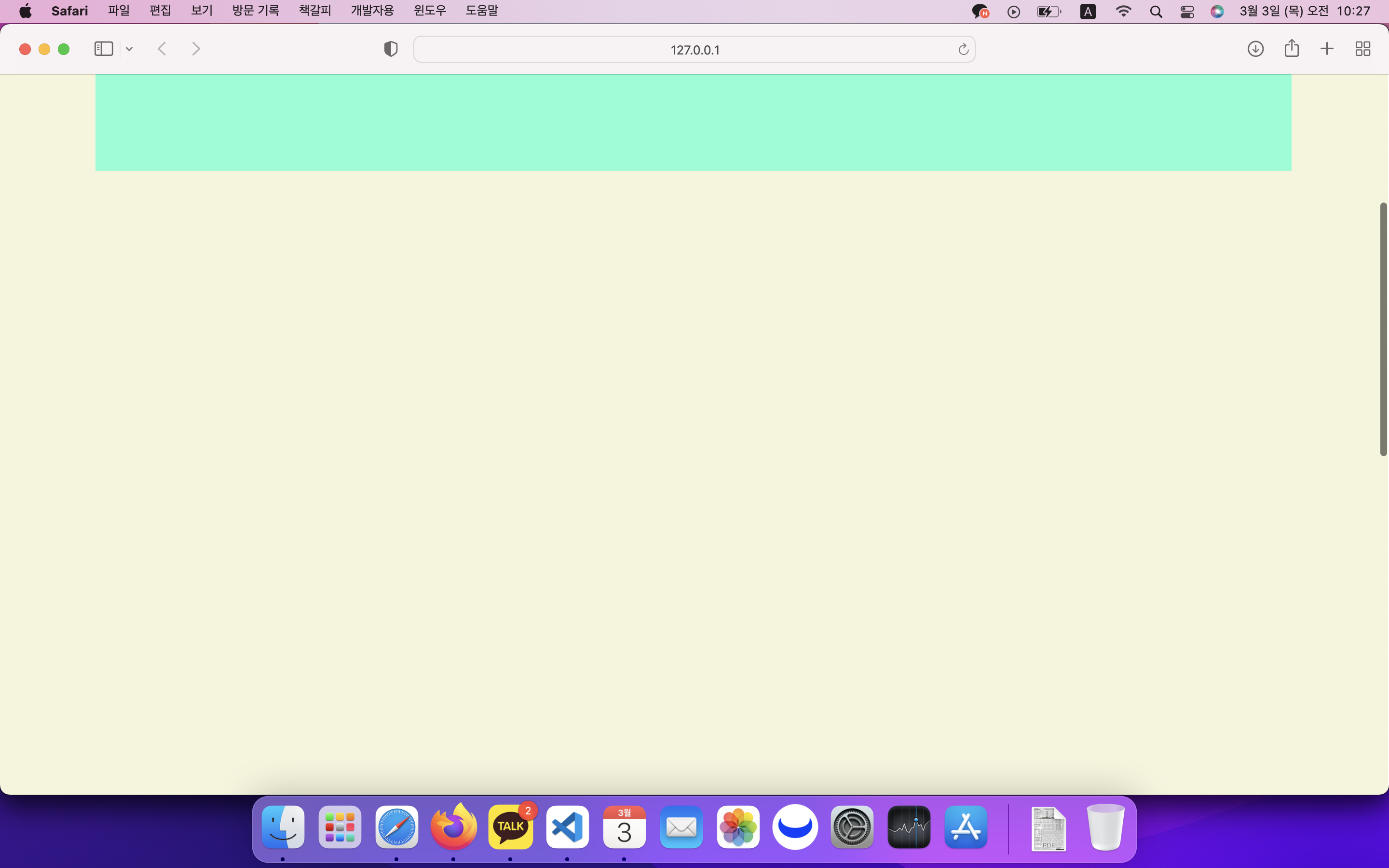
그러면 아래처럼 스크롤을 내려도 상단바가 그대로 고정되어 있는 결과물을 얻을 수 있습니다!
댓글남기기